Sunday, September 2, 2012

INSERTING THE ACCORDION SPRY WIDGET INTO YOUR WEBSITE

Continuing from my earlier posts: I am going to insert the customized accordion widget I created in the last post into my pricing.html.  (See earlier posts for lessons 1-18)

Moving right along, I am ready to insert the accordion widget into my third page called Pricing.  This is definitely getting easier!
 

Overview: In this tutorial, I am going to show you how to insert the accordion widget, add tabs, and change the text in a web page that has already been created! 

(Double-click images to make them bigger.)
Lesson 18
How to insert your accordion widget from my widgets:
  1. Open the - pricing.html. Place the cursor in the .content area of the website and delete any lingering text. From the menubar, click on insert, then widgets (see figure 18.0)
  2. In the widget pop-up, click on jQuery UI Accordion for Widget Browser. And then click on the customized widget you have already created from the previous post. In my case, it is called TexArtisan Cakes, click OK. (see figure 18.1)
  3. The widget will show up as a list. This is normal.

figure 18.0
 
figure 18.1
Lesson 19
How to insert a new tab into your accordion:
  1. Place your cursor on Third within the widget and click on Split to reveal the code. The cursor will automatically appear in the appropriate line of code. (see figure 19.0)
  2. Copy and paste the two lines of code associated with Third right below.
  3. Make sure the pattern matches the code above. Right above the lines of code you just pasted, make sure you see </div> and  <div> just below. If not, then type it in. (see figure 19.1)
  4. Click Live View to check your progress.(see figure 19.1)


figure 19.0


figure 19.1
 

Lesson 20
How to change the text in your accordion:
  1. Un-click Live View.
  2. Simply place the cursor in the line of text you wish to change and start typing. I added more text above and outside of the accordion for extra information. (see figure 20.0)
  3. Save your work.
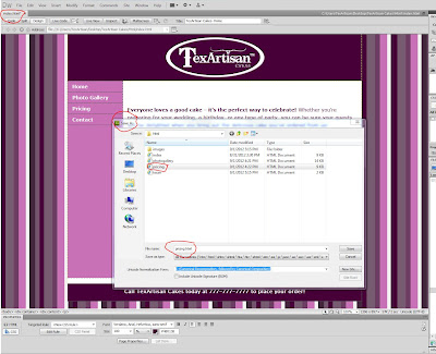
  4. Click file, preview in browser. (see figure 20.1)
  5. See your new creation in a web browser! (see figure 20.2)

figure 20.0
 
figure 20.1
figure 20.2
 

EDITING AN ACCORDION SPRY WIDGET IN DREAMWEAVER

Continuing my crusade to build a website from start to finish! I am going to create the third page of my website and call it pricing.html for my texartisancakes.com website. Also, I am going to create customized accordion information tabs to match my website! (See earlier posts for lessons 1-15)

Accordion tabs are a good way to compress a lot of information in your website. After learning how to edit the slide show widget, (see lessons 11-15) this tutorial was a breeze! I really think I am getting the hang of this!

Overview: I am going create the third page of my website called Pricing and customize an Accordion Spry Widget to match my website!

(Double-click images to make them bigger.)
Lesson 16
How to create your third page and acquire and save an accordion tab widget to my widgets:
  1. Open the index.html that you have already created.
  2. Save as - pricing.html. (see figure 16.0)
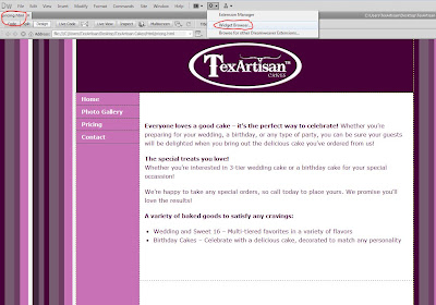
  3. From the menu bar, click on the extended dreamweaver icon (the little icon that looks like the cog of a wheel.) Then click on Widget Browser. (see figure 16.1)
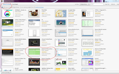
  4. In the Widget Browser, click Adobe Exchange, then scroll down and double-click on jQuery UI Accordion for Widget Browser. (see figure 16.2)
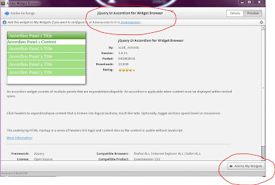
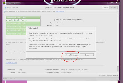
  5. Here you can preview the widget. In the bottom right corner click, add to my widgets. Then click on go to my widgets. (see figure 16.3 and 16.4)


figure 16.0
 
figure 16.1

 
figure 16.2
 
figure 16.3
 
figure 16.4
 
Lesson 17
How to customize the accordion widget to match your site:
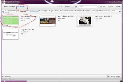
  1. Within the my widgets window, click on jQuery UI Accordion for Widget Browser. (see figure 17.0)
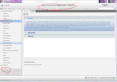
  2. Pick from the list of styles the will best fit the theme of your website. I selected cloudy day. Select configure. (see figure 17.1)
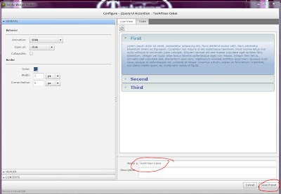
  3. Give your widget a name and save. Double-click on your newly created widget to start editing it . (see figure 17.2)
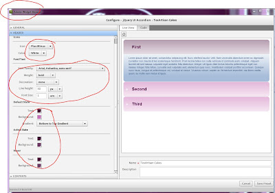
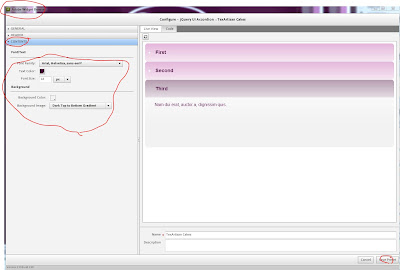
  4. Click on the general, header, and contents toolbars and change the background colors and fonts to match your website.  (see figure 17.3)
  5. Click save preset. (see figure 17.4)

figure 17.0
figure 17.1
figure 17.2
figure 17.3
figure 17.4


Saturday, September 1, 2012

INSERTING SPRY SLIDESHOW WIDGET & ADDING IMAGES

Continuing from my earlier posts: I am going to insert the customized slide show I created yesterday   and import my own images and text into my photogallery.html  (See earlier posts for lessons 1-12)

I am ready to insert the slide show into my second page called Photo Gallery. In this tutorial, I am going to show you how to insert the widget and import and rename your images.
You will need to have two images of each slide.
The first one is a thumbnail at about 25% of the original slide size and the second on is the original slide. I saved mine as .jpgs...

Overview: I am going to insert a slide-show into a webpage I have already created.

(Double-click images to make them bigger.)
Lesson 13
How to insert your slide show from my widgets:
  1. Open the - photogallery.html. Place the cursor in the .content area of the website and delete any lingering text. From the menubar, click on insert, then widgets (see figure 13.0)
  2. In the widget pop-up, click on Spry Image Slide show with Filmstrip. And then click on the customized widget you have already created from the previous post. In my case, it is called TexArtisan Cakes. (see figure 13.1)
  3. The widget will show up as a list and wider than the frame. This is normal.

 figure 13.0
 
 figure 13.1
 
 
Lesson 14
How to insert your images into the slide show:
  1. Click on the first thumbnail image to pull up the properties toolbar at the bottom of the page. (If the properties toolbar is not open, click Ctrl+F3.) 
  2. In the properties toolbar click on source of image or src and repath to your first thumbnail image in your images folder. (see figure 14.0)
  3. In the properties toolbar click on hyperlink or link and repath to your first image that matches the thumbnail. (see figure 14.1)
  4. Repeat steps 2 and 3 until you have uploaded all of your images.

figure 14.0
 
figure 14.1
 
Lesson 15
How to rename your images:
  1. Click on Split to open up the code. Scroll down until you find your images, and rename the text. (see figure 15.0)
  2. Click on Design to close the code and then click on Live View to check your progress!
 
 figure 15.0
 
figure 15.1

Friday, August 31, 2012

WORKING WITH SPRY SLIDE SHOW WIDGETS

Continuing from my earlier posts, I am going to create my second page of my website and call it photogallery.html for my texartisancakes.com website and create a customized slide show. (See earlier posts for lessons 1-10)

So far, I have created the home page of my website. Now I am ready to make my second page called Photo Gallery.  In this tutorial, I am going to show you how to create your second page, and prepare for your slide show by customizing an Adobe Spry Widget in the Widget browser!
 
Overview: I am going create the second page of my website called Photo Gallery and customize a slide-show with a filmstrip by using Adobe Spry Widgets.

(Double-click images to make them bigger.)
Lesson 11
How to create your second page and acquire and save a slide show widget to my widgets:
  1. Open the index.html that you have already created.
  2. Save as - photogallery.html. (see figure 11.0)
  3. From the menu bar, click on the extended dreamweaver icon (the little icon that looks like the cog of a wheel.) Then click on Widget Browser. (see figure 11.1)
  4. In the Widget Browser, click Adobe Exchange, then scroll down and double-click on Spry Image Slide show with Filmstrip. (see figure 11.2)
  5. Here you can preview the widget. In the bottom right corner click, add to my widgets. Then click on go to my widgets. (see figure 11.3 and 11.4)

figure 11.0
 

figure 11.1
 
figure 11.2
 
figure 11.3
 
figure 11.4

Lesson 12
How to customize the slideshow widget to match your site:
  1. Within the my widgets window, click on Spry Image Slideshow with Filmstrip. (see figure 12.0)
  2. Select default, and configure. (see figure 12.1)
  3. Give your widget a name and save. Double-click on your newly created widget to start editing it . (see figure 12.2)
  4. Click on the titles toolbar and change the name of your slide show, the font, and the color of your text to suit your needs.  (see figure 12.3)
  5. Click on the frame and viewport tool bar to change the background colors to match your color scheme.  (see figure 12.4)
  6. Next we are going to size the slide show to fit in our .content area.  To get the size of the area in Dreamweaver, look at the CSS definition rule for .content. Notice under box, the width is set to 780 pixels.  I know that the width of my slide-show needs to be 780 pixels total to fit nicely inside the content area. (see figure 12.5)
  7. Accounting for the 1 pixel width border on the left and right side, (780 px - 2 px = 778px)set the background area width to 778 pixels. (see figure 12.6)
  8. Click on the filmstrip and thumbnails tool bar to change the background colors to match your color scheme.
  9. Click save preset. (see figure 12.7)

figure 12.0

figure 12.1
 
 figure 12.2
 
 figure 12.3
 
 figure 12.4
 
figure 12.5
 
figure 12.6
 
figure 12.7
 

Wednesday, August 29, 2012

CUSTOMIZING YOUR DREAMWEAVER TEMPLATE - PART TWO

Continuing from my earlier posts, I am going to customize my index.html web page for my texartisancakes.com website. (See earlier post for lessons 1-6)

So far, I have created a file structure for my website on my computer, created a logo, a custom background image, and some content for my site. Now I am ready to put the pieces of the puzzle together for my first page.


Overview: I am going to insert my logo, background image, text, and change the color scheme of my Dreamweaver Template to match my site.
(Double-click images to make them bigger.)
Lesson 7
How to insert your background image:
  1. Open the index.html that you have already created. (see lessons 1-3)
  2. From the CSS Styles navigation bar, double-click on body to open the CSS Rule definition for body. (see figure 7.0)
  3. In the CSS Rule definition for body, under category, click background. In background image, path to your background image within your images file. Click apply, then OK (see figure 7.1)

figure 7.0

figure 7.1

Lesson 8
How to insert and center your logo and change the background color of the header:
  1. Next, we are going to change the color of the header from the template-provided green to a purple from our background image.  From the CSS Styles navigation bar, double-click on .header to open the CSS Rule definition for .header. Under category, click background. In background color, click on the color square to open the color-picker tool. Move the color-picker tool over the color you wish to duplicate and click on it. Click apply, then OK. (see figure 8.0)
  2. Next, I am going to insert my logo. Since I want my logo to be centered and not anchored to the left side of the header, I am going to delete the the logo placeholder. Click on the logo placeholder and hit delete on your keyboard. Leave your cursor in the header. From the insert toolbar, click on images and path to your logo. Click OK. (see figure 8.1)
  3. To center the logo, go to the CSS Styles navigation bar, double-click on .header to open the CSS Rule definition for .header. Under the block category, click text-align, center. Click apply, then OK. (see figure 8.2)
 figure 8.0
 
figure 8.1
   
figure 8.2
 
Lesson 9
How to rename the links and change the background and hover colors:
  1. I am going to change the names of the links and the background color next. Simply place your cursor within the link and type in the desired text. (see figure 9.0)
  2. Next I am going to change the background color of the links from the template-provided green to a color from my custom wallpaper. Go to the CSS Styles navigation bar, double-click on .ul.nav a, ul.nav a:visited to open the CSS Rule definition for .ul.nav a, ul.nav a:visited. Under the background category, click on the color square to open the color-picker tool. Move the color-picker tool over the color you wish to duplicate and click on it. In the type category, change the font color and font weight to suit your scheme. I picked white and bold. Click apply, then OK. (see figure 9.1)
  3. Now I am going to change the hover background color of the links. Go to the CSS Styles navigation bar, double-click on ul.nav a:hover, ul.nav a:active, ul.nav a:focus to open the CSS Rule definition for ul.nav a:hover, ul.nav a:active, ul.nav a:focus. Under the background category, click on the color square to open the color-picker tool. Move the color-picker tool over the color you wish to duplicate and click on it. Click apply, then OK. (see figure 9.2)
  4. I want to change the sidebar color to match my links. Go to the CSS Styles navigation bar, double-click on .sidebar1 to open the CSS Rule definition for .sidebar1. Under the background category, click on the color square to open the color-picker tool. Move the color-picker tool over the color you wish to duplicate and click on it. Click apply, then OK. (see figure 9.3)
  5. I deleted the text in the sidebar and simply hit the return key a few times to extend the sidebar color down.
  6. To check your progress, go to live view and hover over your links. (see figure 9.4)
figure 9.0
 
figure 9.1
 
figure 9.2
 
figure 9.3
 
figure 9.4
 
 
Lesson 10
How to change the body text and color and the footer text and color:

  1. You can simply type in your text using the cursor. Or if you want to have it specially formatted, you can create your text in a word document and copy and paste. (see figure 10.0)
  2. To change the properties of the footer, go to the CSS Styles navigation bar, double-click on .footer to open the CSS Rule definition for .footer. Under the type category, change the color and weight of the font. Under the background category, click on the color square to open the color-picker tool. Move the color-picker tool over the color you wish to duplicate and click on it.Under the block category, click text-align, center. Click apply, then OK.  (see figure 10.1-10.3) 
  3. To check your progress, go to live view and see your creation! (see figure 10.4)
figure 10.0
 
figure 10.1
 
figure 10.2
 
figure 10.3

figure 10.4